
Brand Performance Over Time
Track your brand and competitors across Visibility Score, Detection Rate, Position, and Sentiment metrics using the Brand Performance Over Time chart
Trends in Competitive Comparison: How to Read the Big Line Chart
The Brand Performance Over Time chart is the big line chart at the top of your dashboard and your most important trend reporting tool. It shows your brand together with all tracked competitors over your chosen time period.
In this article, you'll learn how the chart is structured, how to use the seven available metrics, and which reading mistakes to avoid.
What you'll find in this article 👇
-
Which metric for which question
-
What the chart shows
-
Latest Values and trend indicators
-
Show data table for complete ranking
-
The seven metric options
-
Best practices
Which metric for which question
The metric you choose depends on your question:
- "How are we doing overall?" → Visibility Score
- "Are we even being mentioned?" → Detection Rate
- "How high up are we?" → Position or Top 3 Visibility
- "Are people talking about us and if so, is it positive or negative?" → Sentiment Score
- "How many touchpoints are we generating?" → Mentions
- "How authoritative are our sources?" → Citations
If you don't know where to start, stick with Visibility Score as your default. It combines Detection Rate and Position in a compact way.
What the chart shows
The chart has three sections:
- Line chart in the middle with one line per brand
- Latest Values panel on the right with your brand and top competitors
- Show data table toggle below the chart for the complete brand table
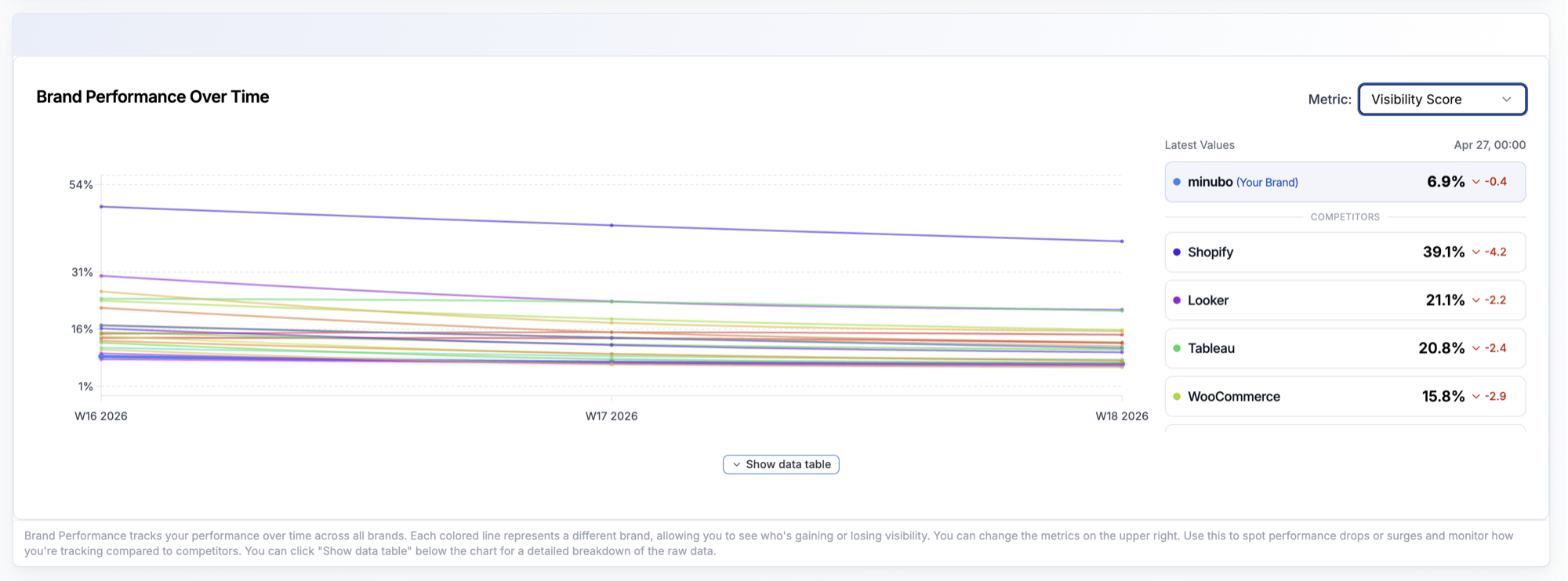
Your own brand is marked with (Your Brand) in the Latest Values panel and highlighted in color. Below that are the competitors in the COMPETITORS section, sorted by the currently selected metric value.
Latest Values and trend indicators
In the Latest Values panel on the right, you see for each brand:
- the current value of the selected metric
- a trend indicator with ▲ green or ▼ red and the absolute change compared to the comparison period
The comparison period is determined by the Timeframe and Aggregation in your filters. So with "3 Months / Weekly", you're comparing to the previous week.
- Use the trend indicators to quickly spot the biggest movements instead of comparing lines individually.
- A red trend for your brand at the same time as green trends for multiple competitors is the most important early warning signal: you're actively losing ground in the category.
Show data table for complete ranking
The Latest Values panel only shows the top brands. If you want to see the complete table of all tracked brands, click on Show data table below the chart.
The table shows all brands, not just the top ones in the Latest Values panel. For one example customer, that was over 35 brands including their own, direct competitors, and many category-adjacent tools.
- Search the table specifically for brands you suspect are in your competitive landscape but don't see in the Latest Values panel because they're not in the top.
- Export the table if needed using the PDF button in the top right, along with the current chart snapshot.
The seven metric options
Use the Metric dropdown in the top right to switch between seven metrics. Your selection changes what the lines display:
- Visibility Score: (Default) Aggregated headline metric that combines Detection Rate and Position. The best single-number answer to "how visible are we right now?"
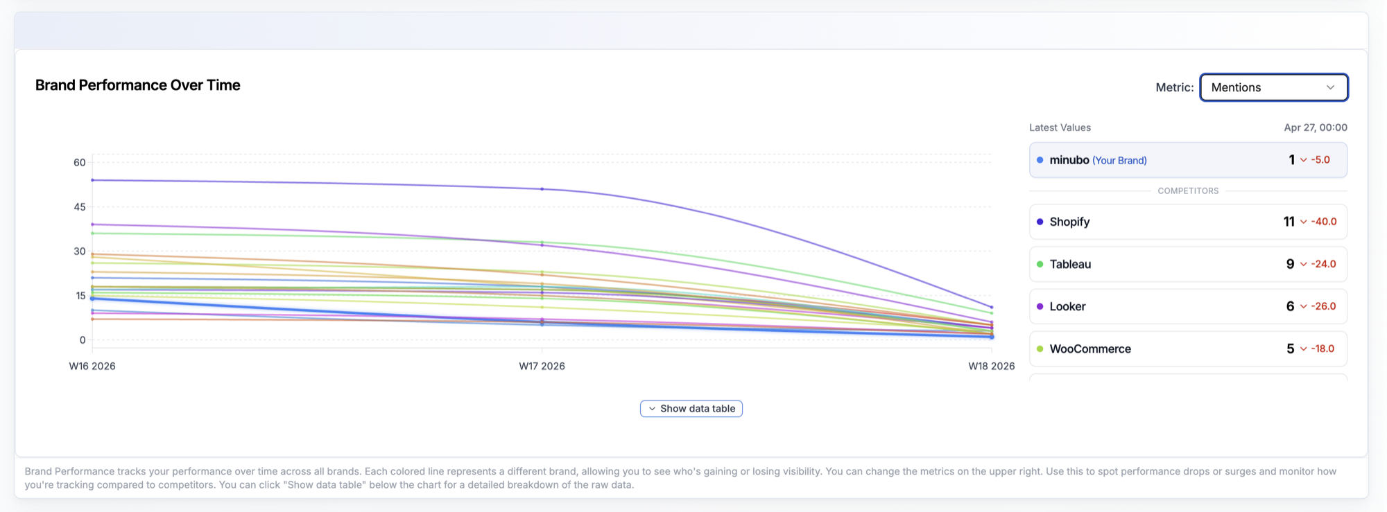
- Mentions: Absolute number of mentions per bucket. Reach perspective.
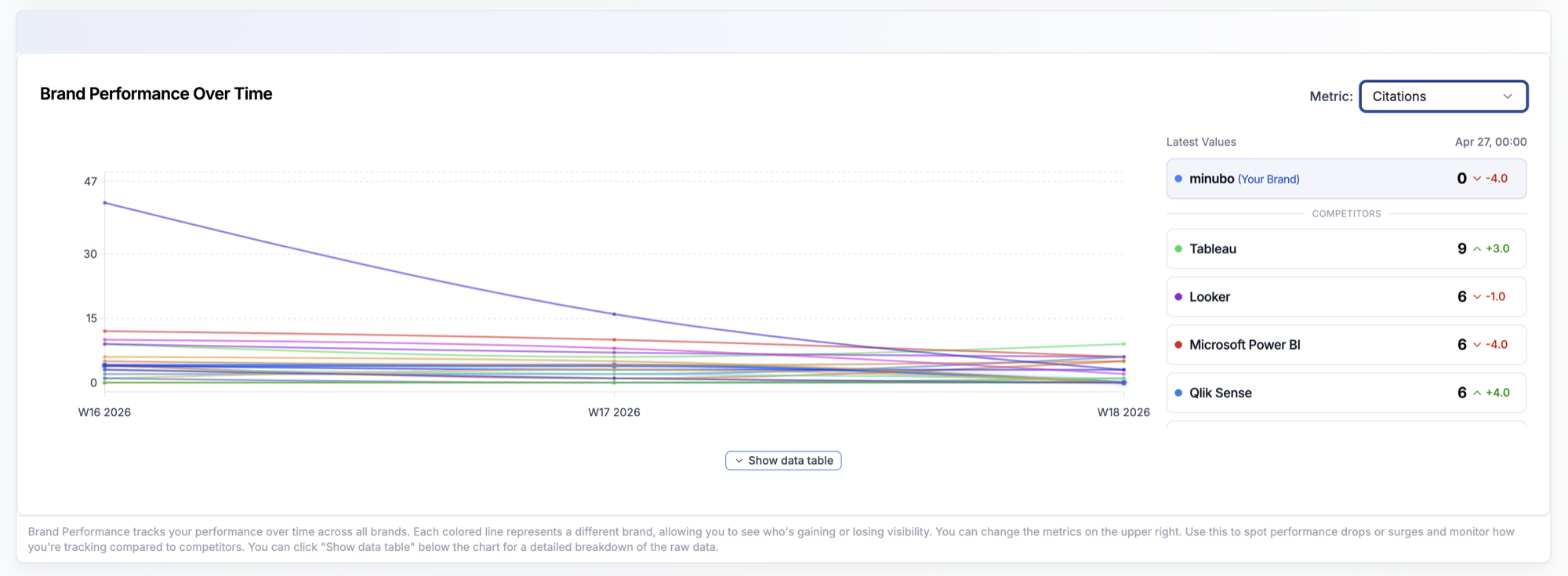
- Citations: Absolute number of citations per bucket. Source perspective.
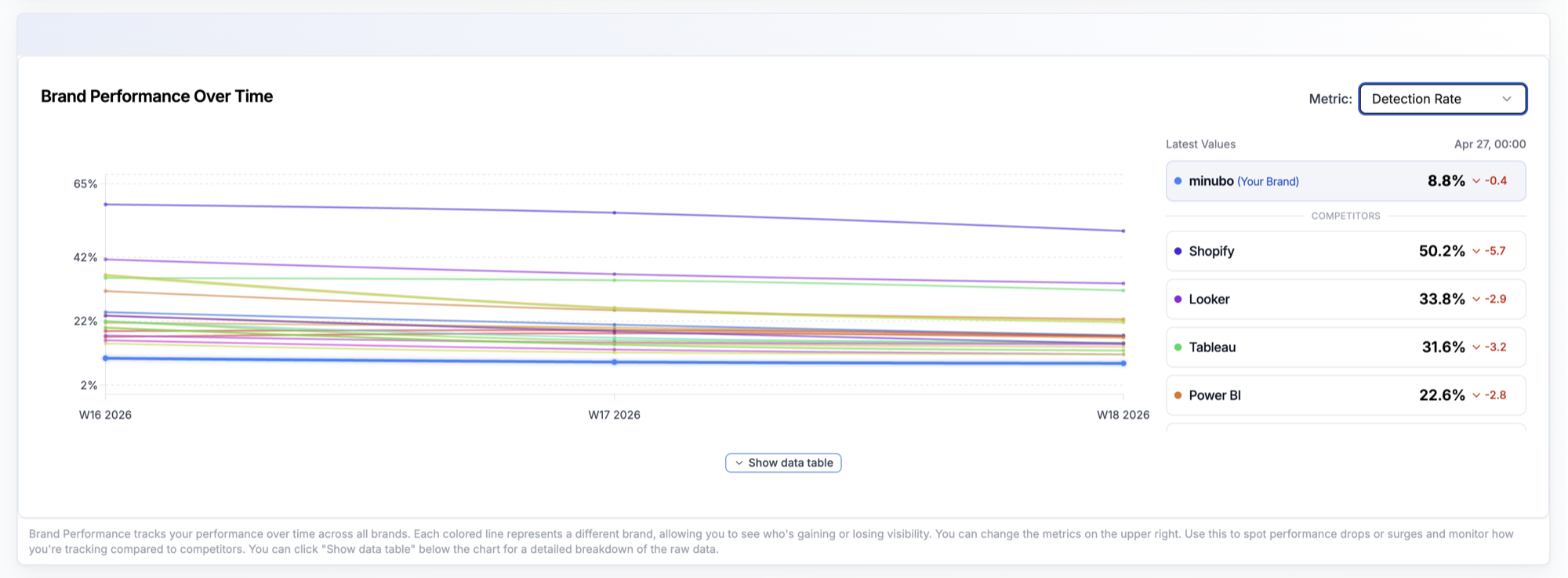
- Detection Rate: Coverage share. Answers: in what proportion of prompts did we appear?
- Position: Average ranking position when the brand was found. The lower, the higher up you're positioned in answers.
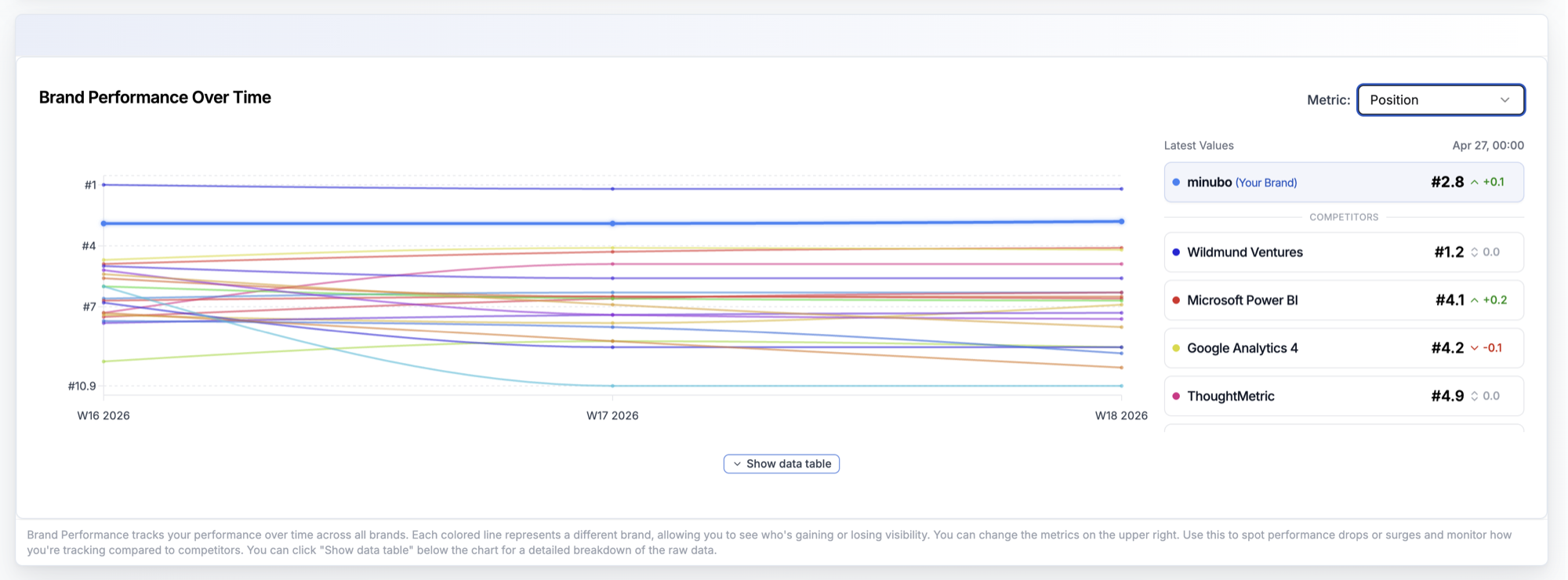
- Top 3 Visibility: Share of tests in which the brand was among the top 3 recommendations. Stricter than Detection Rate.
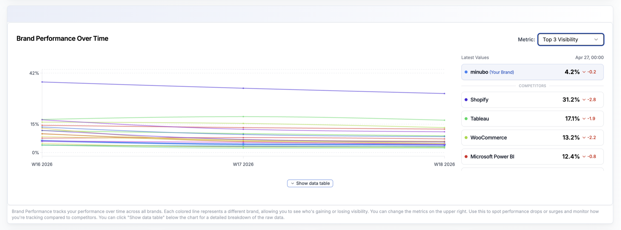
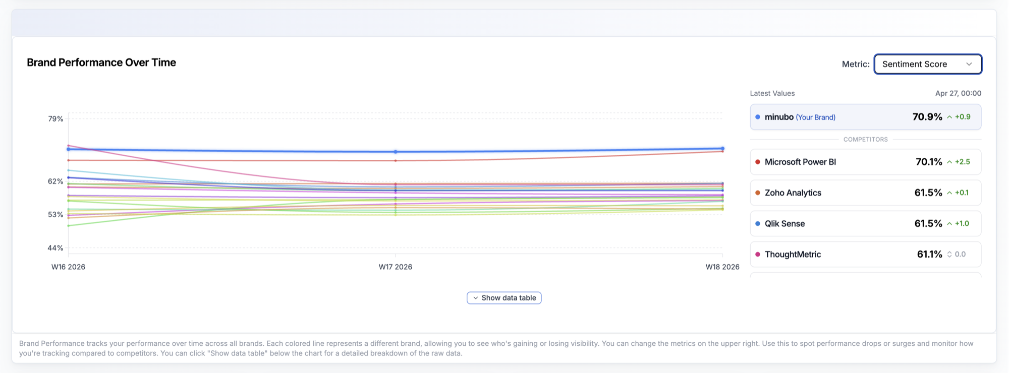
- Sentiment Score: Tonality score when the brand was found. 0% = negative, 100% = positive.
Best practices
Never compare just yourself, always compare in context
- Problem: If you only look at your own line, you miss whether the movement is absolute or relative. A declining brand can look better if everyone else is declining faster.
- How to: Look at your line in parallel with the top 3 competitors in the Latest Values panel.
- Result: You spot movements in competition, not just your own trajectory.
Switch the metric instead of reading too much into one metric
- Problem: If you treat Visibility Score as the only truth, you miss that a declining score can have many causes (fewer mentions, worse position, fewer citations).
- How to: When Visibility Score tells you something, jump to Mentions, Position, and Detection Rate to isolate the cause.
- Result: A trend observation becomes a concrete hypothesis you can act on.
Use per-period jumps for half-yearly reviews
- Problem: Reporting deadlines often ask "How was Q1 vs. Q2?" not "How was last month?"
- How to: Set the Timeframe to 3 Months and compare with Previous period to the previous quarter. Note the value for each relevant metric in both periods.
- Result: Clean quarterly comparisons you can put into slides or QBRs.
The Brand Performance chart is the only place in the dashboard where you can see the direct competitive comparison for each individual metric. When stakeholders ask you "how does competitor X compare to us?", this is the right widget.
 Powered by happysupport.ai